Of two days, four scripts and two sets that looked like eight
Two days is a lifetime in production. The experiences, the learnings, the follow-through, the planning, the coordinating, the things we eventually pull off, and the grace with which we go through the 48 hours, can really say a bunch of things on the kind of team you have and the kind of team player you are. If you’re happy at the end of the said two days, well then congratulations, you’re pretty much set. Literally.
2018 hit the ground running with the guys from JWT calling us for a Britannia film. Two firsts for Do. Creative Labs. We’d never worked with either party before, and firsts are always special - even more so, when it’s the first project of the year.
The script was pretty straightforward and yet, gave plenty wriggle-room for creative license. The storyline was a Myth vs. Reality kind of scenario for Britannia Nutrichoice, and intended to bust some dreadful expectations about the healthy life. The structure of the film called for eight individual scenarios, which translates to eight sets in production terms. With less than forty-eight hours between PPM and shoot, we didn’t have the luxury of time on our hands. But we did have a great team and that made all the difference.
Our very own production design "Do.-er" Amrutha Ramanan worked closely with Art Director Pooja on the production design to figure out and bring alive what our Director Sahit Anand had in mind for the sets. We’d established that the sets would have two primary colour schemes - Green which is the Nutrichoice colour - would rule the positive scenarios, with some play of pink and blue to reinforce the positive elements. Red, which is an obvious tone of danger, was the main shade in the Myth section with suggestions of orange and yellow to make it look markedly different from the positive scenarios.
Especially since we didn’t have time for guessing games, Amrutha aided the process by producing 3D renders of the set as briefed by Sahit. This provided us with an image of how things would turn out and from here on, we could just add and remove elements - so that the sets wouldn’t look same-old and repetitive across the sequences. This helped flex the possibilities with the props and the colours to create a frame that really did POP and had its own individualistic character. The treatment allowed for a lot of play and we tried to bring in as much fun and whimsy, along with the abstract and defined elements. The stylist Wardha and the director planned for looks and colours that would add another dimension to the entire scheme and define the character’s mindset in the particular scene.
In the Sleeping-in vs. Working-out sequence, the styling brings a marked difference in the attitude. If in the sleep sequence, the styling is very “spoilt child” reminiscent with baby yellow and polka dots, she is made to look fierce and feline in her racerback and sweats as she punches away at the bag.
The dread of working out and exercise, is made loud and clear with the purple racerback - purple bringing to mind breathlessness, bruises and pain. The fresh yellow and blue flowy feminine cuts make a happy contrast for the Glow sequence.
We dressed the boy choosing take-out in the most sloppy look. Even in terms of casting, we looked for a boy with a roguish air about him. And dressed him up sloppily in tees and hoodies. Doing this in the Expectation sequence, brought out his clean, shiny and ‘bakes a mean vegetable casserole’ Reality alter ego, all the better.
In the final sequence, where the character chooses the Nutrichoice cookie over the samosa, we kept the change very subtle, just to bring about the feeling of how easy it is to make a healthier choice. The healthier choice here doesn’t require an earth-shifting change - so we kept the frames compact and the styling almost-confusingly similar, except for a change in shirt colours.
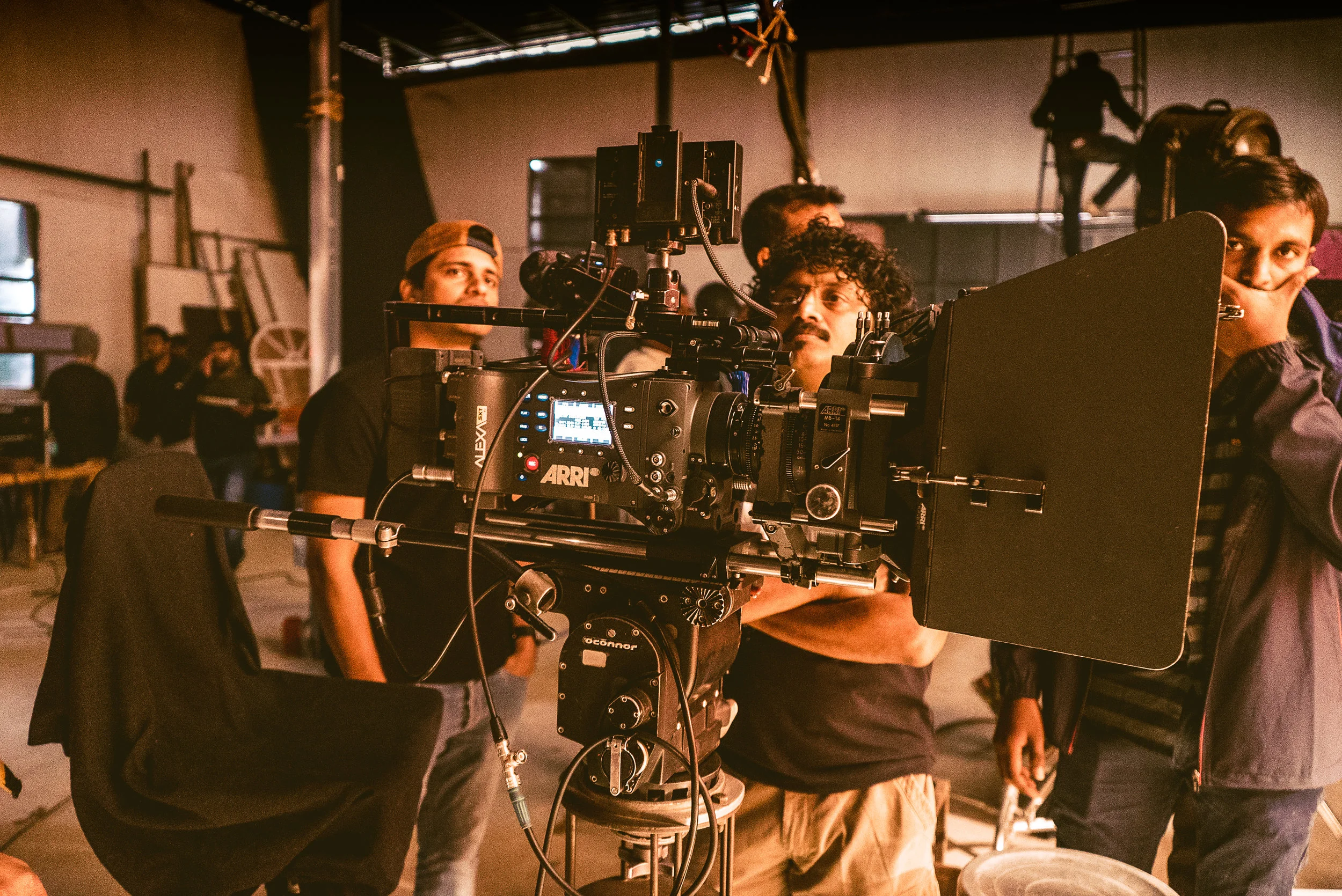
This shoot saw us play around with new a lot. Pooja experimented with some new materials that we’ve not worked with before - but turns out, is quite popular in the industry. And saved us a lot of critical turn-around time. We worked with DoP OmPrakash for the first time, who brought with him new insights on how we could work more efficiently. We finally shot on Arri - long time coming, that. We worked for the first time with DJ Raka Ashok on the music, who made a fully-participating, character of a track that elevated the craft of the film. Short deadlines are by all means a time-bending drug that makes every minute and second of 48 hours, high-functioning chunks of time. When everything is a blur and in super high definition all at once. Looking back, we’re beyond thrilled at how we once again found a way to work together and crafted a film that will look pretty nice on our reel. All in all, we couldn’t have asked for a better start to the year.
PS. All praise and glory to Whatsapp groups - the patron saint of co-ordination.


