How to turn a location into a storyteller
There’s always a starting point for every film. That one thing that will lead a narrative. No, we’re not talking about just the script. Sometimes it’s a certain kind of music, sometimes it’s the editing style, sometimes it’s the styling, sometimes it’s the backdrop better known as art direction.
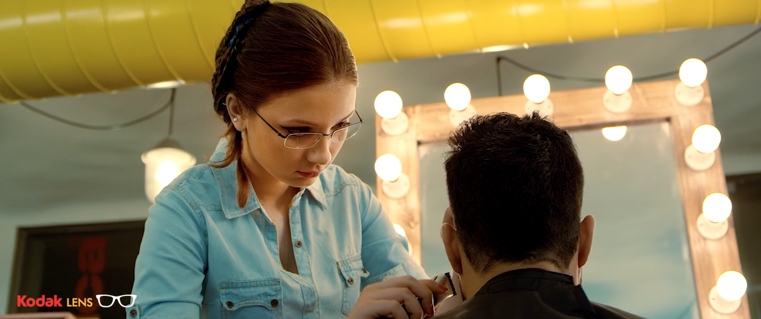
The script for Kodak Lenses that the folks over at Water brought us was about detail and precision. In a 30 second window, what is meant to be a detail, can pass by in a blur. Or get boring. This is where and why we decided to let the background lead the narrative.
“In a 30 second window, what is meant to be a detail, can pass by in a blur. Or get boring. This is where and why we decided to let the background lead the narrative.”
For the salon film, we scouted for the brightest, most-warmly lit and visually engaging salon we could find. The colours of the family was deliberately kept pastel to bring out their complete lack of interest in the first half of the film. This makes the Monroe mural in the background take on the lead role in that particular frame, and the family is relegated to mere supporting roles. The salon stylist and the actor are juxtaposed against a neutral palette, making them the most dynamic elements in the film.
“In this film, the kitchen is not his friend. It’s a place of scrutiny. This kitchen with its steel overtones was a chatty start for the narrative.”
The second film is set in the kitchen and is around a man’s attempts at wowing his family with his culinary skills. And of course, they’re not impressed by his basic cake. In this film, the kitchen is not his friend. It’s a place of scrutiny. This kitchen with its steel overtones was a chatty start for the narrative. It amplified his self-doubt in the long shot by being an overpowering presence. As his confidence grew, we got closer and closer and filled the frame with more him that his intimidating surroundings. When reduced to a blur, the background worked well to help him stand out in his moment of glory. The styling picked the green sweater for the same reason. It interpreted differently depending on the camera's movements. In his times of trouble, it melded him into the background - just as his family saw him with his average cooking skills. Just as we get closer and closer, with the details it becomes an article of clothing that really becomes him.


